Rent Collection Redesign
Background
Azibo is a financial services platform for Landlords that provides solutions for rent collection, managing finances, and finding tenants.
Rent collection is the main feature used by Landlords and it was important to optimize the design of it to keep user retention.
My role
I lead the redesign of the rent collection experience alongside a product manager and two engineers. My role included the research and discovery work, concepting the UI/UX, visual design/illustrations, prototyping, and user testing.
Time span
1 month
Goals
Redesign and improve the user experience of Azibo’s rent collection feature by addressing long-standing pain points and adding helpful features to suit our user’s needs.
Decrease the amount of support tickets by improving the UX/UI of viewing and managing rent payments.
Create less frustrations during rent collection to decrease user drop off.
The Problem
Key Information is not surfaced
When viewing incoming payments, Landlords should be able to immediately see who has or hasn’t paid rent and easily view necessary details about their invoices.
Pain points
Users have difficulty seeing their payment’s status, history, and timeline.
There are many support requests around when their payment was sent and when it will be deposited.
Poor Discoverability
Invoice Details
Viewing the invoice details opens a drawer that includes actions they can take such as: send a reminder, edit rent amount, and record a payment.
Pain Points
Users find it difficult to find key information.
There is an overload of information, some being unimportant to the user.
CTAS are not shown in the correct visual hierarchy and taking actions within the drawer feels clunky.
Original Rent Homepage
Original Invoice Details Drawer
Research
Finding the priority paths
We looked at Pendo flows to determine our user’s main needs when viewing payments.
I also worked closely with the head of customer support to gather insights on our user’s pain points.
Diagram shows where users are clicking when viewing their rental payments.
Card Ranking
Due to the short time span of the project, I decided to send out a quick card sort.
12 Landlords ranked payment features based on what was most important to them during rent collection.
I also left an open question for users to provide any feedback.
Ideation
The priority path
Based on customer support tickets, pendo data, and user feedback, I was able to rank the tasks by importance and frequency of use. This heavily defined the UI and was referenced while concepting.
Final Design
Rent Homepage
How can we clearly show payment statuses?
To easily identify a payment’s status, I color coded chips and badges to the status.
I also refined the table’s columns to the most important information; removing “Category” and adding “Date paid”.
Secondary text was added to the table to add additional helpful information such as days when a payment will be overdue and how long it’s been overdue.
Easily understand rent status
Landlords can filter the table by payment status when clicking on the chips.
This opens a drawer with a table that’s columns and actions are catered to the payment’s status.
Example
Overdue payment’s drawer has a “Send reminder” CTA
Paid payments drawer shows columns with the date paid and date deposited.
Less Visual Noise
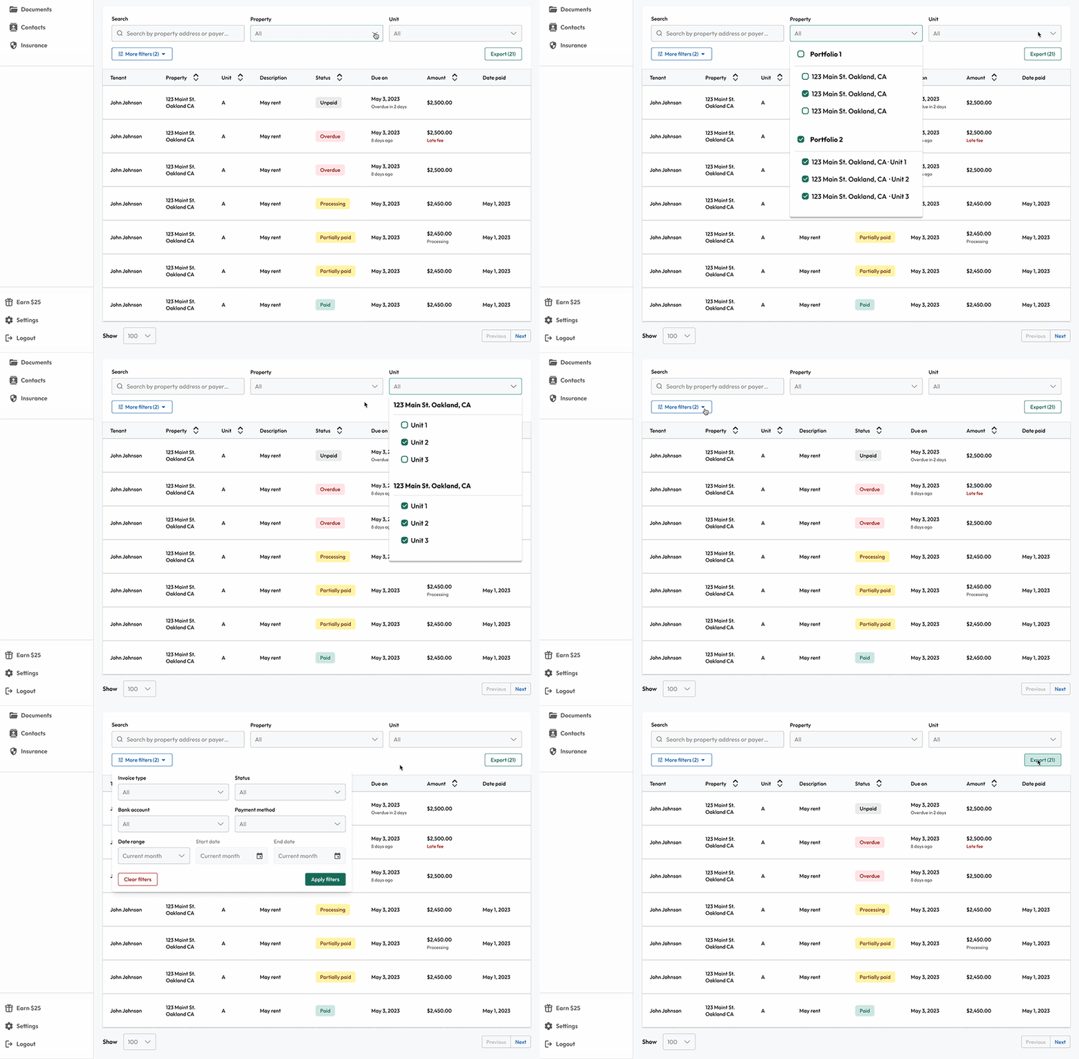
Filters were reduced to the most important ones: Search, Property, and Unit. More filters are hidden to reduce visual noise.
The export button was moved from the top header to under the filters since the filters effect the payments that are being exported.
Invoice Details
How can we improve discoverability with UI?
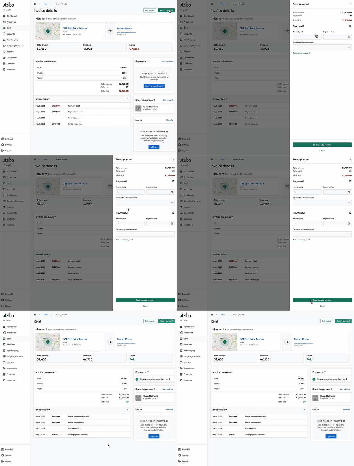
Rather than having the information squished within a small drawer, I designed the invoice details full screen to provide breathing room and less clutter.
Important information is broken into cards with the CTAs in the correct hierarchy.


Recording payments
Taking actions within an invoice opens up a drawer. Recorded payment shows up in the Payments Card. The original design did not have any way of viewing and managing recorded payments.
Editing an invoice
The original design only allowed a Landlord to edit the total rent amount. I wanted to use an interactive table to make editing amounts easier by showing the entire rent breakdown.
The user can easily toggle on/off late fees, partial payments, and delete the invoice from this drawer.


